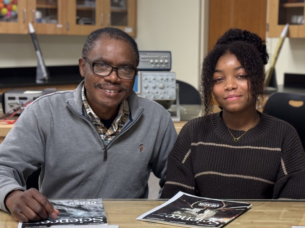
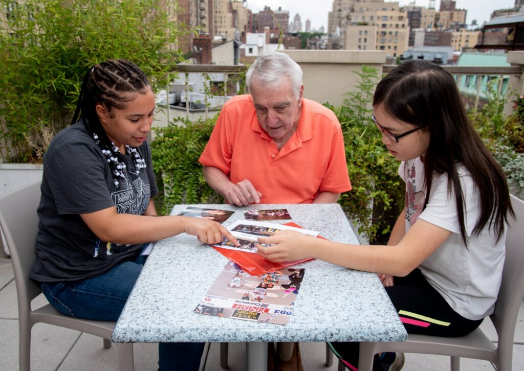
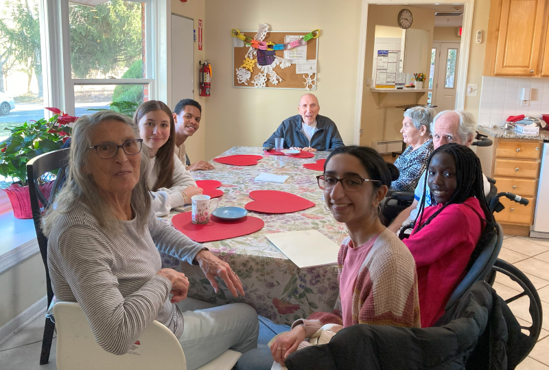
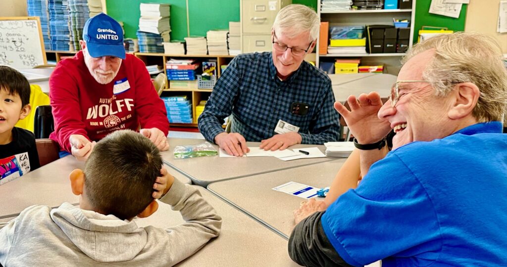
Those of us working in the field of aging are facing an entrenched issue. The images of older adults that saturate advertising, even news stories, often limit older adults to one of two types:
- As people who deserve pity, services and help. Such people are generally depicted as incapable of being part of a solution and as having little left to offer the world beyond a good long story that’s been told one too many times.
- Or, as energetic white upper middle-class people who are ready to tackle the world in retirement, and by tackle the world, we mean exercise gracefully, travel, visit faraway grandchildren and eat in upscale restaurants, all while picking up a long forgotten or new hobby.
We know that neither scenario in any way comprises what it means to be aging or to be an older adult, and yet, as we continue to argue that we need to see each person as an individual with specific needs and specific opportunities, we must remember—perception is reality.
If we want to shift funding priorities, gain the attention of corporate America, drive great program design, and reach policy-makers, then we must rebrand the current image of aging seen in U.S. media and advertising.
So, what is a brand? A brand is a company’s or organization’s public image, reputation and identity as it would like it to be promoted. This extends beyond the images we use for company logos and marketing. As a nonprofit or company looking to rebrand your image, we thought it would be instructive to share our recent experience and help aid the process with some practical tips.
Should You Rebrand?
First and foremost, the question we had to ask ourselves was, “Do we need to rebrand?” For ASA, we felt our logo was dated, but also recognized by our core members. In the end we decided that yes, despite a recognizable logo, we needed a full rebrand of ASA’s image, which included our logo, publications and corporate website, as well as all the materials that we distribute).
Ensuring that our brand was reflective of who we are and how we wanted to be perceived was more important than the recognition of our old logo. As you look at your logo, you will want to decide if you need to refresh or a rebrand, and that decision should be based on your long-term goals for your organization. We knew we wanted the new company branding to represent our more modern commitment to our membership, as we looked at bold new ways to serve members. We also wanted the logo to reflect the optimism we were all feeling about ASA’s direction, the world of aging and the opportunities that lie ahead.
In deciding whether or not we wanted to rebrand, it was imperative that we had a solid grasp of our goals and if they made it worthwhile to take on the financial and emotional costs that would be incurred throughout the process. People often are attached to logos, so as you decide whether you need to rebrand, make sure that you have consulted your stakeholders to determine their investment and readiness for a new look and feel.
Get Help. We hired a wonderful branding company to guide us through the process. In choosing who to hire, you’ll need to look at your budget, but also their expertise. Are you looking for someone who can simply help you with the design elements or do you also want them to help you implement the new look into your marketing efforts? Do you need someone who can help you design and release the new brand? Do you already have a powerhouse marketing department in-house, and if so, are you really looking to out-source only the branding expertise, which will bring in new perspectives?
‘Releasing our brand in a very public, engaging and sustained way was really important to us.’
How you decide to move forward with this will be determined by your goals, your individual situation and of course, your budget. In our case, we worked with Turnstyle of Seattle, who interviewed staff, board members and ASA members to get their input on everything from the programming we would be offering to an understanding of our members.
It was imperative that the company really understood us, which can sometimes feel difficult with an outside vendor or consultant. But by working with someone from outside of our organization, they brought fresh perspectives and ideas. It may seem wasteful if you have a strong in-house marketing department to invest in an outside vendor for this work, but having that outside perspective often brings in a new level of creativity and new ideas that you might not have considered. Remember branding and marketing are related, but not exactly the same thing and should strongly support each other when done well.
Don’t Waste This Moment. Releasing our brand in a very public, engaging and sustained way was really important to us. We didn’t just want to share the new logo, branding and websites, but we wanted to share everything (programming, membership engagement and goals) about ASA’s transition and reconnect with new, existing and potential members.
Rebranding was a call to action for our members to become re-engaged with ASA. Releasing a new brand was an opportunity to connect with members and soon-to-be members. To paraphrase the play Hamilton, don’t waste your shot. Rebranding is never just about a logo. It is about reconnecting and having your audience reinvest with you. Finding a way to make this impactful to your audience is integral to the success of the effort.
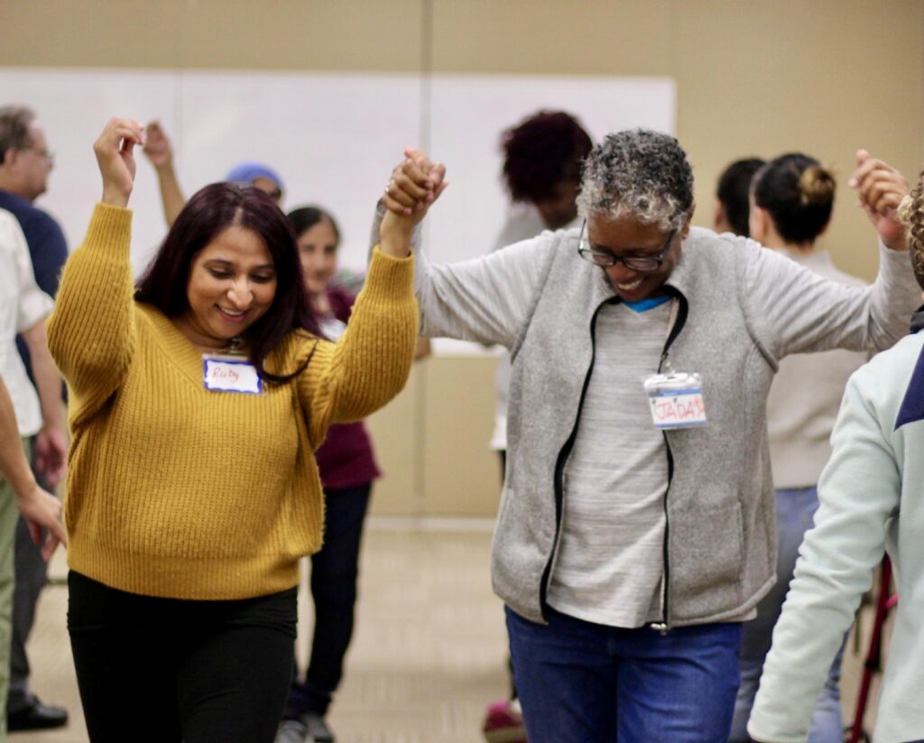
Be Inclusive. So often in branding, we don’t use inclusive imagery or language, and often we inadvertently use ageist or ableist stereotypes. ASA has committed deeply to ensuring that our imagery and language showcases diversity, inclusion and a broad spectrum of what it looks like to be an older adult in the United States. Our goal is to be inclusive in our imagery, showing aging in a realistic way, with people of different races and ethnicities and socioeconomic, ability and health status. But this is a learning process and we continue to make a conscious effort to consider diversity in everything we do.
Think Long-term. Rebranding is a big project. Your brand should not define you, but it should clearly describe you, energize you and represent you. And that means that it should be definitively associated with you. Changing it too often can be detrimental, but appearing out of date or out of touch can be just as bad. Make sure that you are building a brand that can last and feel timeless, but be prepared to recognize when you have reached that time limit and it is again time to update.
That brings us to Home Instead, one of ASA’s longtime partners, and a company that also just rebranded. Their rebrand included a slight name change and a modernization of their long-standing logo, which held a lot of personal meaning for its owners. We asked them to tell us about their process, as they looked at it from the corporate perspective, which was a little different from ASA’s work as a nonprofit. In the second part of this series, we asked them to dig into rebranding from that perspective.
Cindy Morris is ASA’s vice president, Development and Community Engagement.


